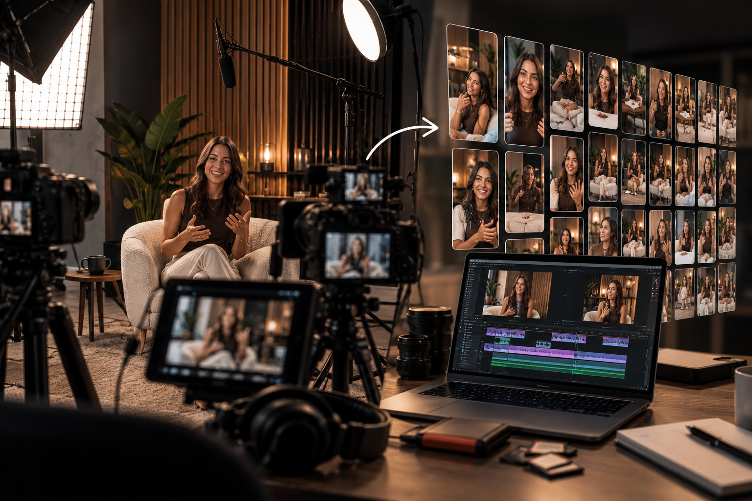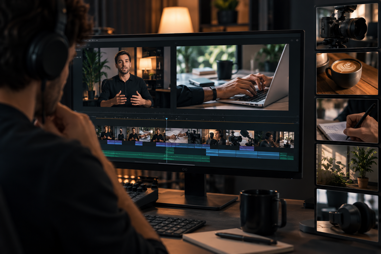


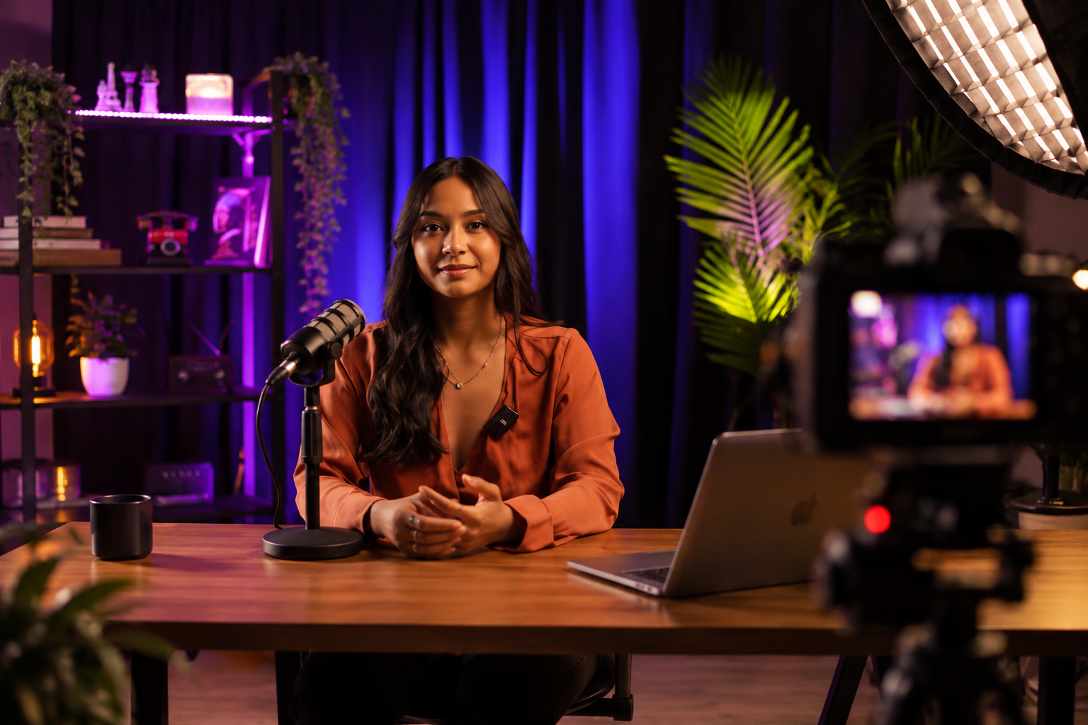
Most companies guard their brand palette carefully. The logo, the deck, the website, the social templates — all of it gets checked against a style guide before it ships. Then the same company records a video with whatever lighting, wall color, and wardrobe happen to be in the room that day, and nobody stops to ask whether any of it matches the brand at all. Video is usually the last format to get brand-checked, and often the first one a prospect actually sees.
The Disconnect Between Brand Guidelines and Video Output
A style guide typically governs typography, logo spacing, and a locked set of hex codes — but rarely says anything about how a spokesperson should be lit, what color the wall behind them should read as on camera, or what wardrobe clashes with the palette entirely. The result is a brand that looks deliberate everywhere except the one format where a prospect spends the most uninterrupted time with it.
That gap isn't usually intentional. It's just that color consistency in video requires decisions made before recording — lighting gels, backdrop selection, wardrobe guidance — and those decisions rarely make it onto anyone's checklist.
Why Color Consistency Builds Subconscious Trust
Viewers don't consciously register that a video's color temperature clashes with a brand's palette. What they register is a vague sense that something feels slightly off, even if they can't name why. Visual consistency across every touchpoint — including video — is part of what makes a brand read as considered and established rather than improvised. A prospect who has seen a brand's blue on the website, the deck, and the email signature expects to see some version of that same blue in the video too, even if only at the edges of the frame.
When a video's visual world has no relationship to the rest of the brand, it reads as disconnected from it — as though the video was made by a different company than the one on the website.

Lighting, Wardrobe, and Set Color as a Pre-Production Decision
Getting a video's palette to actually match a brand isn't a color-grading fix applied after the fact — color grading can only push footage so far before it starts to look artificial. The real work happens before recording: choosing a backdrop or set color that echoes the brand palette, lighting that renders skin tones accurately under that color, and wardrobe guidance that avoids clashing with or disappearing into the background. Done at the production stage, brand color becomes part of the frame instead of a filter applied over it.
Strategic Takeaway
A brand palette that stops at your website and starts over — or disappears entirely — in your video isn't a minor inconsistency. It's a visible gap between how considered your brand looks everywhere else and how considered it looks in the one format where prospects spend the most time with it.
What If the Setup Was Handled for You?
Matching a shoot's lighting, backdrop, and color palette to a brand isn't something most teams think to plan for, let alone execute well on their own — it requires pre-production decisions most people only learn by getting them wrong once. That's where a studio built for brand-consistent production is useful: the lighting and set are already built to render color accurately, and a crew can work from your brand palette before you ever sit down. Villo Studio in Canggu, Bali, is set up to do exactly that — so the video you walk away with actually looks like it belongs to your brand, not like it was shot in whatever room happened to be free.